NOJO
I led the visual rebrand of NOJO, a local ramen shop, creating a clean and modern identity that matches the warmth and quality of their food.
Client
nojo ramen
Services
Visual Design
UI & UX Design
Tool
Figma Photoshop
Date
Sprin 2024
OVER VIEW
NOJO is a Japanese style ramen shop located in San Francisco. While the food earned loyal fans, the brand identity lacked cohesion and didn’t reflect the shop’s warm, high-quality experience. I led a visual rebrand that brought clarity, simplicity, and modern Japanese aesthetics to life across menus, signage, and digital platforms.
Deliverables
Logo redesign
Typography & color system
Menu layout
Website & in-store applications
Design Goals
Refresh the brand while honoring Japanese minimalism
Improve menu readability and hierarchy
Create a consistent visual system across platforms
Balance simplicity with warmth
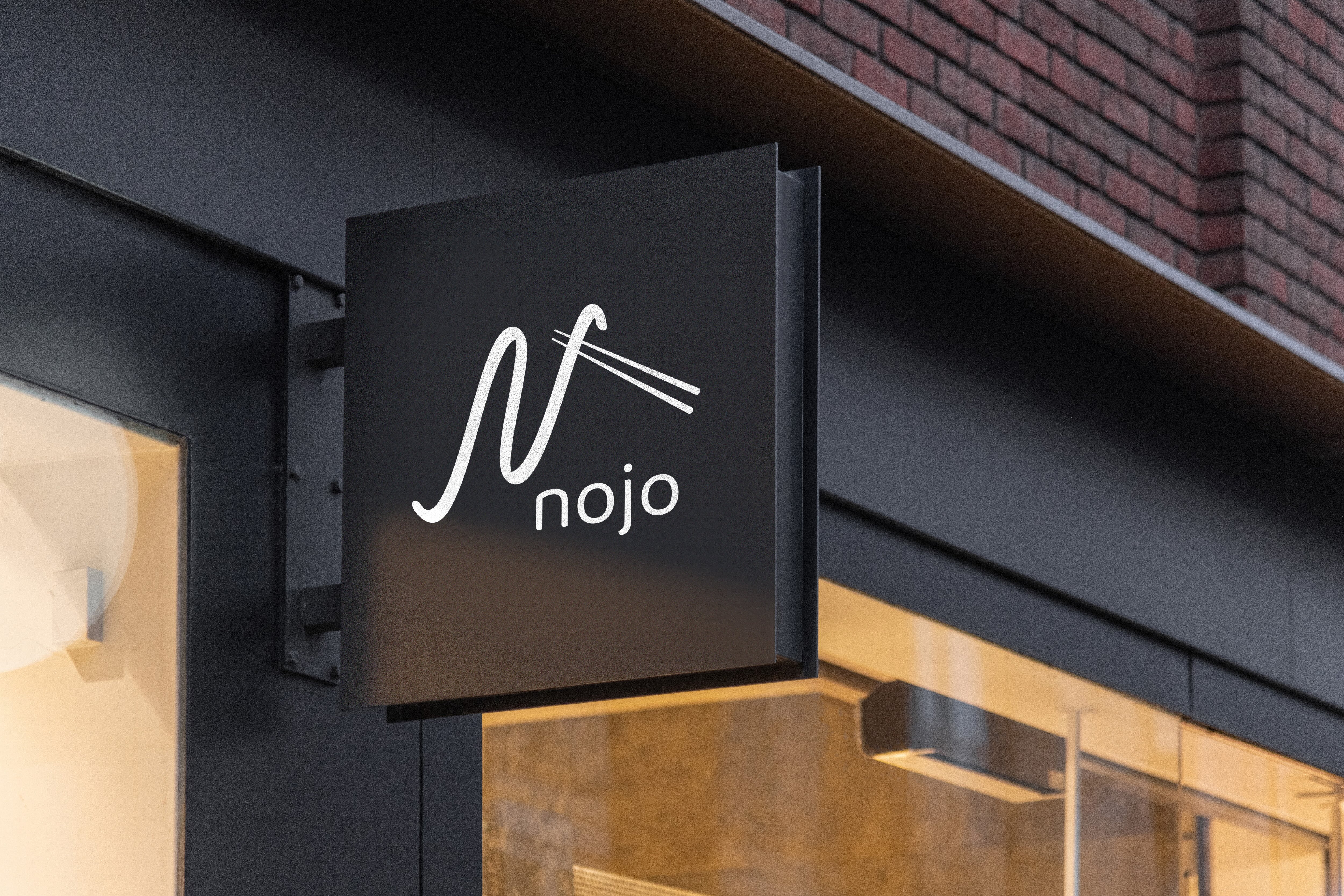
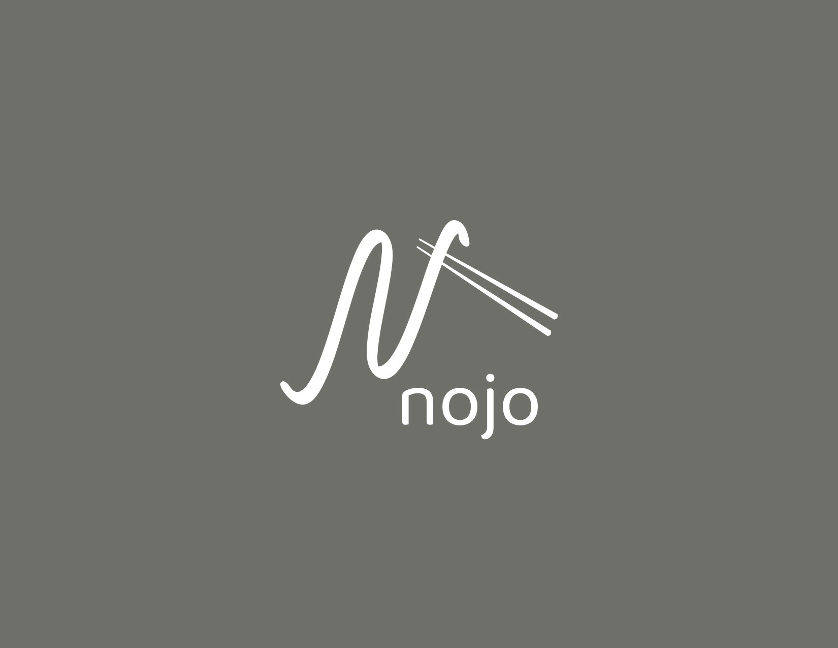
The NOJO logo is inspired by the flowing, circular movement of noodles—simple, continuous, and satisfying. I focused on clean lines and balanced spacing to reflect the elegance of Japanese calligraphy while subtly referencing the shape and rhythm of ramen noodles in the letterforms.
MOCK UP
Menu layout


